![]()
This is a medium-length ramble on how the webmaster personally approaches ART, pertaining mostly to COLORS. The tone is laid-back, and utilizes some occasional strong or cheeky language.
The webmaster admits he is not exactly proficient in desirable color theory, and therefore, hopes you will take his observations with a grain of salt. This article was originally a response to an asker on another platform, and the webmaster has decided to archive it here for anyone curious or bored.
------------------------------
Colors are hard, and as a result, I have always pushed my art to be a little rough. Geometric, solid. Artificial. Perhaps a little ugly, a little utilitarian, a little beautiful. To have a certain degree of loud, indefatigable vigor. To depict with clarity and harshness, to not be muddied by uncertainties and excess. To be deliberate. Perhaps some of these choices were made to compensate my struggles with colors. In this context, I utilize a few key "principles" in my pursuit for artwork which reflects my inner world, which I will attempt to outline below.
COLORS BE DAMNED: when I am finished, this better still look fun in black and white.
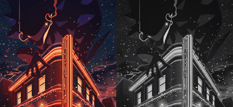
PERSONAL OPINION: Color is but an accessory to visual hierarchy. A picture should read clearly in black and white. Ensure the things you want catching attention are receiving the attention they need, before a viewer begins to explore the rest of your piece. Generally goes hand-in-hand with rules of composition. Within PHOT0SHOP, the webmaster personally recommends IMAGE> MODE> GRAYSCALE or ADJUSTMENT LAYER - BLACK AND WHITE. There are minute differences in methodologies but it is usually good enough to get you started.
Remember all those charts about what each color represents? Red for passion or violence, blue for calm or sadness, yellow for greed or joy? Colors can have so many different meanings assigned to them. Why not make up some associations of your own?
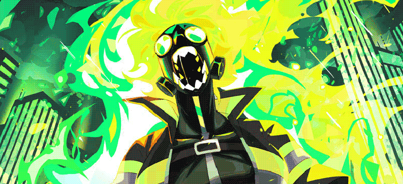
The Webmaster's Thoughts While Working On This Piece: "What if...Fire...Green..."
Sometimes it's fun to use a color for what it can evoke, or for turning a familiar idea into something completely new. For example, attempting to paint a green sunset might be more fascinating and amusing than painting a purple-red-orange one. Your audience may also shoot you funny looks, which is cool and ideal.
This is the only actual, legitimate, from-the-book color theory advice here.
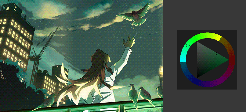
It is a well-established method to limit your palette to one color family (monochromatic painting), but if you want to push this further, you can color in ANALOGOUS COLORS, aka the colors next to the main color you are painting with. If you are struggling to choose a good color palette, I find that this one is often a winner, limiting what you can work with, but also generally being quite nice to look at. This rule of limiting your palette for maximum win honestly goes for most accepted color wheel combinations, but I personally favor using analogous colors.
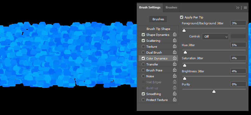
In the way watercolors can be about relinquishing control and bending to patience, so too can you relinquish control to the randomness of...BRUSH SETTINGS AND FILTERS! Make your medium do the work for you. Half the joy of color can be the pleasant surprises you get from experimenting with parameters.
✶ Shoals
[Originally Published 12.29.2021]