![]()
This page is a retrospective for the 1st version of INFINITE SHOALS, aka "SHOALS v1.0-ff00ac-HELL". I use the word retrospective very loosely, so probably don't expect any actual learning experiences here haha.
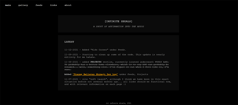
Infinite Shoals had a short-lived "beta" version: a simple, plain black-and-orange theme which lasted for maybe all of a week before I decided I was having enough fun with web design to try hit the site with a full-on theme. It was still a very nice and reliable theme, utilizing one of my favorite color schemes of all time, so I would like to take a moment to memorialize it here.
There were two things I really wanted to acheive when I first began the process of building this site. The first, of course, was to select a title that encapsulated the purpose of this site to me. A sort of guiding star, so to speak. The second most important thing after...was to have a catchy, silly subtitle, because I could. This snippet of thought should explain my general philosophy towards the site: while it is something I deeply care about and want to take seriously, I should be able to have some Damn Fun with it.
For the former, I eventually landed on the title of "INFINITE SHOALS". This website is intended as a personal retreat that is ever growing. There had been some back-and-forth on several different water-themed geographic locations. Infinite "Beach" had a connotation of being kind of romantic and sexy. Infinite "River"...seemed a bit too much like a theme park ride... Don't get me started on Infinite "Lake".
"SHOALS" appropriately captures my goal for this site: though it like but a small, shallow sandbar flanked by waters much bigger, vibrant, and volatile than what little currently rests on these shores, it is still a region that has "INFINITE" potential and possibilities to be explored :)
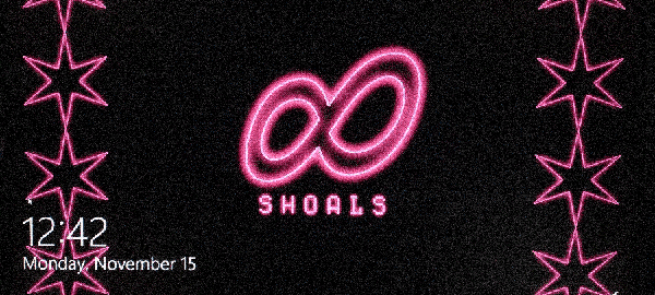
>> Initial "prototype" logo.
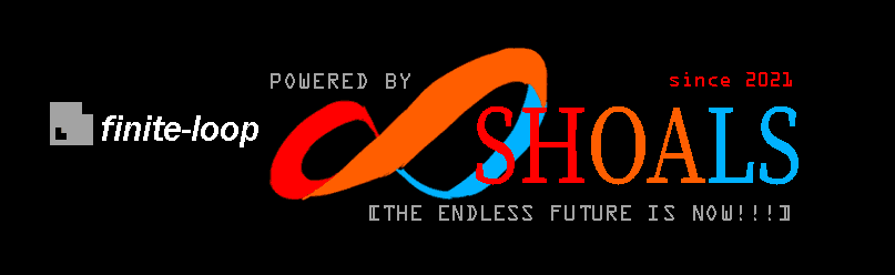
After deciding on the site name, I threw together a quick mockup for a logo, vaguely throwing back to designs of the 90's-early aughts... doofy colors, INCREDIBLY questionable choices with a multi-colored "SHOALS", and of course, some classic serifs. If I'm being honest, I still like this sketch a lot and will probably bring this color scheme into the logo for another theme or page eventually.
I tend to make names/the visual representation of names more complicated for a layer of "mystery", with enormous quotation marks. To elaborate...it is enjoyable when things can be read in multiple ways, or their initial meaning slightly obscured. In this case, I did want for the logo to read "POWERED BY SHOALS" as much as it could be "POWERED BY INFINITE SHOALS". Never mind the fact some people might read it as "POWERED BY INFINITY SHOALS", which could work too.
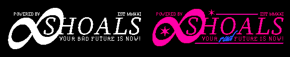
The sub-title ended up taking a turn for the slightly morbid, going from "THE ENDLESS FUTURE IS NOW!" to "YOUR BAD FUTURE IS NOW!" If I am being honest, I was just having fun. I do kind of miss the earlier sub-title though. It had a bit of a sweet air to it.
(As of the 21st of November 2021, the subtitle has became "YOUR RAD FUTURE IS NOW!". I am fairly confident at some point it will become "YOUR DAD FUTURE IS NOW", but when, remains to be seen.)
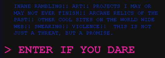
The above image is a snippet from my early plans for a landing page -- initially, it was to have some kind of sassy, snappy warning upfront in the spirit of giving people an opportunity decide if they really wanted to jump in. I think there is a lot of fun in inane threats hiding potential fun and mystery, but over time, the copy for the page got a little tamer, because I did start taking it a bit more seriously. This is the first impression of the site people will probably have, so I personally wanted it to have some gravitas or sense of invitation :P CONTRAST TO...the landing image...
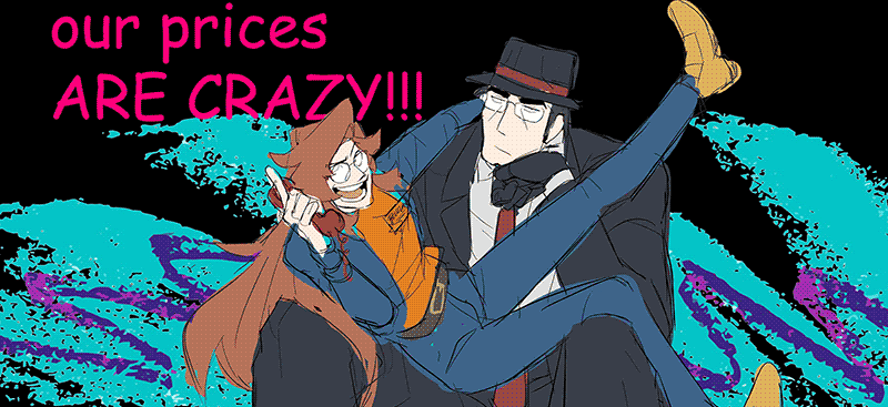 | Initial sketch for landing page image. How about that Jazz, eh? (I am sad that didn't make it into the final, so you know this is another thing I am going to shoehorn in eventually)
I chose two of my favorite characters to be the ambassadors for this front page/the site overall. I did not want it to be myself for the layer of anonymity and a desire to remain as merely the architect for the operation. In all fairness, these two characters are, like many of my characters, extensions of myself in some sense, so it is not all entirely a mystery what I am like, I think.
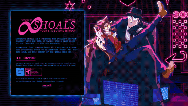
The landing page art ended up informing a lot of the overall colors for the site. I jumped back and forth quite a bit on the color scheme multiple times before settling with reliable pink-purple-blue :)
After completing the landing page, I went ahead and re-themed the rest of the pages to follow suit.
The six-pointed star is a common motif in this theme, something I picked out specifically as a shared design element with the Chicago flag. While I do not reside in Chicago, I am very fond of visiting the city, and I agree with a wide consensus that it has one of the coolest flag designs, as far as US city flags go. If I had to make any remaining changes to the logo, it would be to add a couple of these stars in there as well to really tie the whole thing together.
Added some finishing touches with some light animation and some general wrangling. Overall, the final results came together better than I could have hoped. It was a great experience rigging up bits and bobs of code together to create something cohesive.
Lastly, the "version" title SHOALS v1.0-ff00ac-HELL in itself is fairly silly in origin. #ff00ac is the screaming pink color you see across the site amidst all the blue. It's only HELL because I had no idea what I was doing for a good portion of it, until things clicked together in the end.
Creating this theme was a lot of fun, and I was very happy to be able to utilize my art in a functional manner. I'm looking forward to making more themes for this site in the future, but for the time being, I hope you enjoy looking at it as much as I enjoyed putting it together :)
Until next time!
✶ Shoals
[Originally Published 11.17.2021]
[Last Edited (code adjustments/image adjustments/minor syntax edits) 1.25.2022]